Walk into the Indian snacks aisle at Heathrow’s Terminal 4. Then walk into a kirana store in Nagpur. In both locations, Haldiram’s looks like Haldiram’s.
That might seem obvious. It’s actually exceptional.
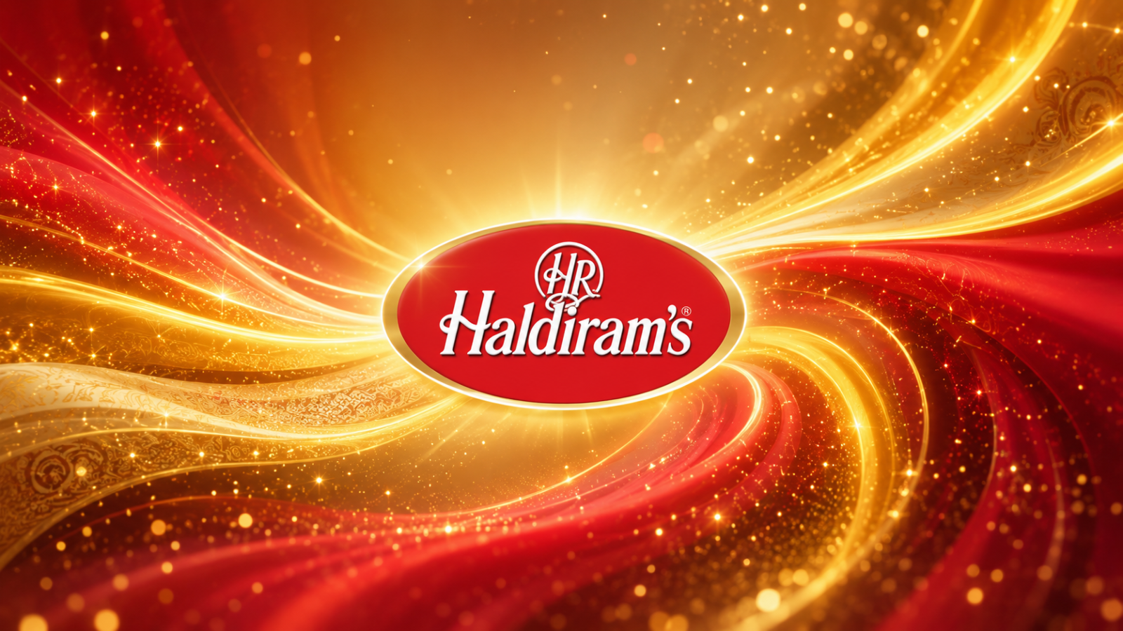
Haldiram’s packaging operates on a consistent visual vocabulary: rich gold-yellow backgrounds, deep red and maroon accents, traditional motif borders inspired loosely by Indian textile patterns, and heavyweight display typography. The effect reads as “premium traditional” festive enough for gifting, familiar enough for everyday purchase.
This is a rare design achievement: a visual language that works simultaneously across price points, formats, and geographies. The ₹10 bhujia pack and the ₹500 gift tin look like they belong to the same family, same colour logic, same ornamental framing, different execution.
The key design principle at work is hierarchical consistency. The core palette and border language stay constant. Secondary elements, illustration style, pack shape, hero imagery adapt to the product and occasion. This “fixed core, flexible expression” architecture is what professional design systems call a “brand system” and most brands struggle to implement it.
For Haldiram’s, the gold-red palette also does cultural work. Gold signals prosperity, celebration, and quality in Indian visual culture. Red signals auspiciousness. Together, they place Haldiram’s in the same emotional territory as Diwali mithai, a positioning that competitors selling plain Western-style snack packs simply cannot access.
Takeaway
A strong colour and pattern system can communicate across price points, formats, and geographies without a single word. Designing a “fixed core, flexible expression” system is harder than designing a single good pack and far more valuable.