In the late 1980s, the hair oil market in India was dominated by coconut oil (Parachute) and light mineral oils. Bajaj Consumer Care launched Almond Drops with a clear positioning: almond-enriched, non-sticky, for modern hair care.
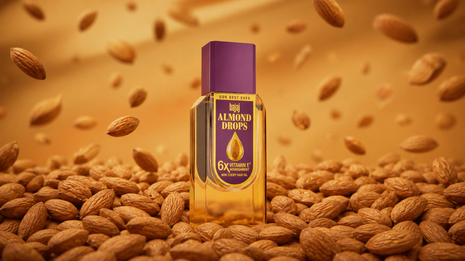
The product was novel. But the design decision that made the brand was the yellow bottle.
Yellow is not arbitrary. In consumer psychology, yellow signals lightness, brightness, and non-heaviness the precise opposite of the thick, dark oiliness that consumers associated with traditional hair oils. The visual cue — clear-to-yellow, slim bottle communicated “non-sticky” before the label was read.
This is what designers call “design for conviction.” The package design doesn’t just contain the product; it pre-communicates the product’s primary benefit through visual cues. A consumer picking up the Bajaj Almond Drops bottle in a dark kirana store could infer “this is lighter than Parachute” from the bottle’s colour and shape alone.
The slim, modern bottle silhouette also helped. Traditional coconut oil bottles were wide, rounded, and utilitarian. The Almond Drops bottle was taller, more elegant, more urban-feeling, visually appropriate for the aspirational consumer who wanted to feel modern about their hair care routine.
The brand has held its position for over three decades with minimal design changes. Again: once you own a visual signal that is this clearly linked to your benefit, changing it is erosion, not evolution.
Takeaway
Great product packaging communicates the primary benefit through visual cues, shape, colour, material before a consumer reads a single word. Design for conviction, not just for aesthetics.