Tea is India’s most exported agricultural product. And yet, for decades, Indian tea brands were almost entirely absent from international premium retail. The premium end was owned by established Western brands.
Bala Sarda launched Vahdam Teas in 2015 with a specific thesis: Indian tea, marketed directly to international consumers at source, with packaging designed to international premium standards, could capture the margin that had always gone elsewhere.
The design brief was clear: Vahdam must look like it belongs on a premium shelf in Manhattan, not in a Delhi general store.
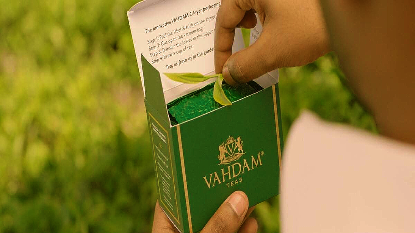
The result is packaging that deploys classic premium signals: clean white backgrounds, restrained gold accent typography, high-quality photography of tea estates and leaves, minimal copy hierarchy, and a distinctive canister format for loose leaf products that signals giftability and permanence.
None of this is accidental. International premium tea consumers have a specific visual expectation of what “high quality loose leaf” looks like and Vahdam designed directly to that expectation, not to Indian FMCG conventions.
The business model is D2C, primarily through international e-commerce channels. This means the packaging is the primary brand experience. There is no store associate to recommend it, no in-store sampling, no retail environment to create context. The pack must do everything: attract attention in a thumbnail, communicate quality, justify a ₹1,500-3,000 price point, and survive international shipping.
Vahdam’s design success proved that the premium tea market was a positioning gap, not a product gap. India had the tea. It was missing the design and brand architecture to claim the premium price.
Takeaway
In D2C, packaging is the entire brand experience. Design to your target market’s visual expectations, not your home market’s conventions, especially when positioning into a premium international price tier.