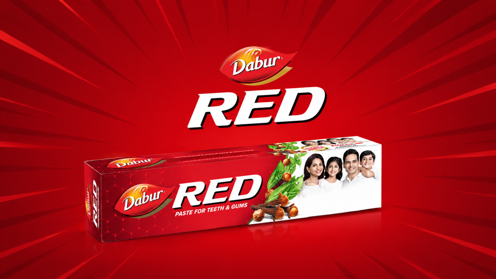
The toothpaste aisle in 2000 was a sea of white and green. Every major brand communicated “clean” through clinical colours and clinical language. Then Dabur launched a toothpaste that was visually red and the paste itself was red.
This was a calculated risk. Red is not a “clean” colour in consumer psychology. It’s bold, strong, intense. For a toothpaste, it’s alarming ,unless you reframe it.
Dabur’s reframe was Ayurveda. The red didn’t signal synthetic, it signalled clove, laung, babool, herb power. The colour that would have failed in a conventional toothpaste brief worked perfectly in an herbal positioning. Red became potency, not danger.
The packaging backed this up: traditional imagery, Sanskrit-adjacent design elements, a slightly denser visual layout that communicated richness rather than minimalism. Where conventional toothpaste said “clean,” Dabur Red said “strong.”
This is colour-context dependency at work. No colour means the same thing across all categories and framings. Red in a herbal context means something completely different from red in a pharmaceutical context. The brand designer’s job is to understand what the colour will mean to the specific consumer, in the specific category, given the specific positioning, not what the colour means in the abstract.
Dabur Red crossed ₹1,000 crore in annual revenue by 2019 and became one of Dabur’s flagship products. It succeeded not just on product quality but on a packaging and colour strategy that made it immediately legible as a distinct alternative to the clinical mainstream.
Takeaway
Colour meaning is context-dependent. The same colour can signal danger in one category and potency in another. The right question is not “what does this colour mean?” but “what will this colour mean to my consumer, given my positioning?”