Lijjat Papad was founded in 1959 by seven women in Mumbai who borrowed ₹80 to buy pappad-making ingredients. Today it’s a ₹1,600+ crore cooperative with 40,000+ women members. Its branding is as unconventional as its origins.
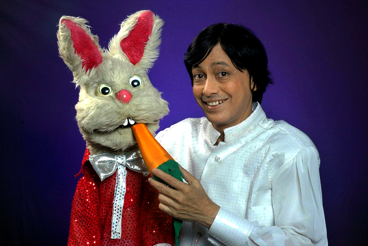
The rabbit mascot, simple, round, slightly cartoonish & doesn’t appear in any brand brief from a professional design agency. It grew organically through the cooperative’s visual identity over decades, eventually becoming standardised as the brand’s primary visual element. It’s illustrated with the charming imperfection of folk art: simple lines, flat colour, no gradient or shadow.
By conventional brand design standards, it shouldn’t work. Mascots are supposed to be strategically designed, character traits mapped to brand values, visual style tested with focus groups, personality documented in brand guidelines. The Lijjat rabbit had none of this.
And yet it works because the mascot is the brand. The rabbit’s slightly naive, wholesome quality mirrors exactly what Lijjat represents: a grassroots, women-led cooperative making something simple and good. A sleeker, professionally designed mascot would feel incongruous, like putting a corporate logo on a hand-embroidered product.
The lesson for brand designers: brand authenticity is the hardest thing to manufacture and the easiest thing to destroy. When a brand identity has grown organically from a genuine community, the job of the designer is to systematise and protect, not to improve.
Takeaway
Not all brand identity needs to be strategically engineered. Identity that grows from genuine community values often has an authenticity that designed identities cannot replicate. The designer’s role in these cases is preservation, not creation.