Brand colour ownership is one of the most underrated assets in marketing. When a colour becomes associated with a brand so deeply that it becomes a category signal, the brand gains something competitors can’t easily buy: visual priority in the consumer’s brain.
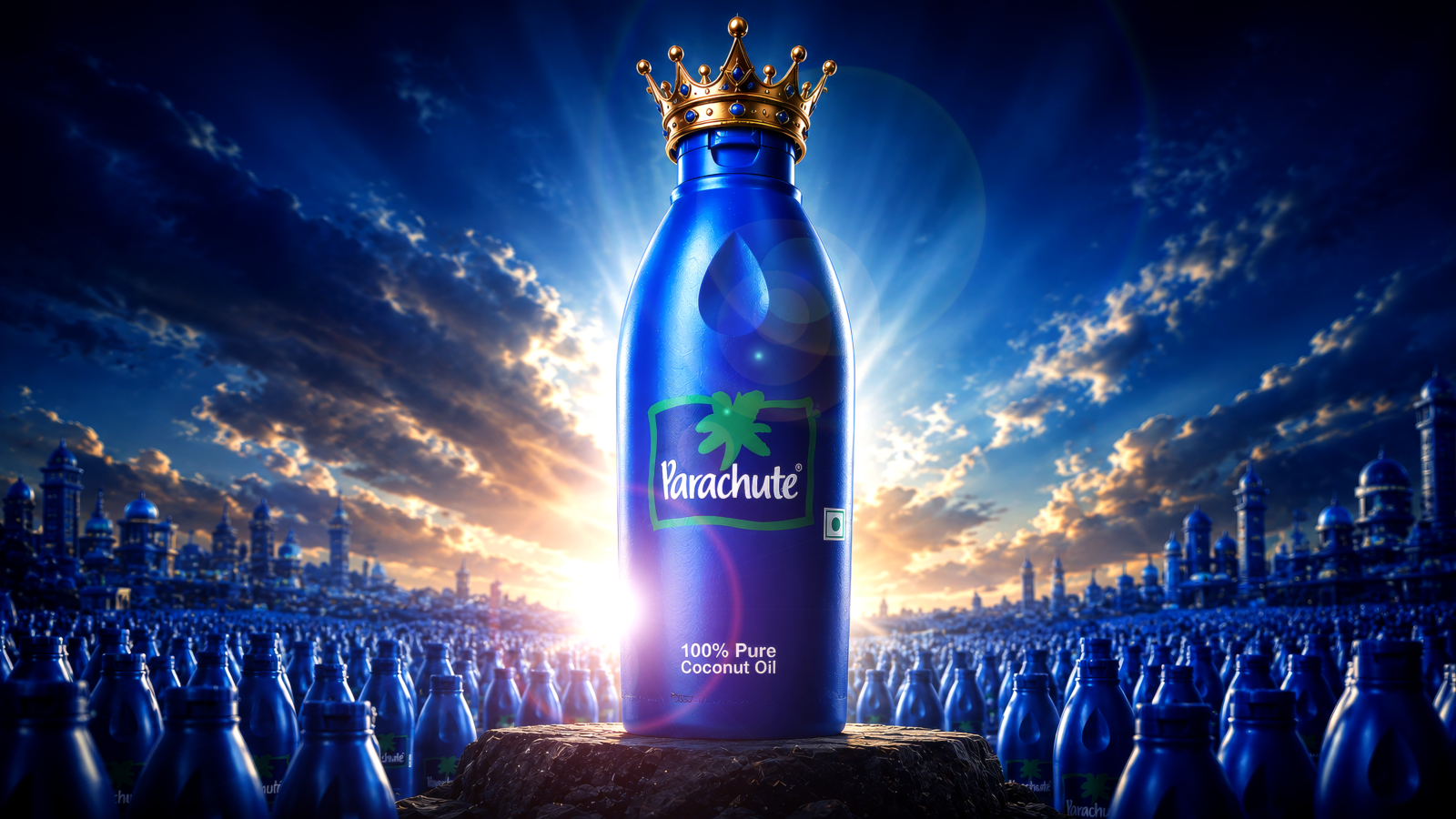
Parachute owns blue in the coconut oil category. Full stop.
Marico’s blue bottle launched in the late 1980s and became the default packaging for the category. Competitors entering the market have repeatedly faced an uncomfortable choice: use blue and look like a Parachute knock-off, or differentiate with another colour and fight against category-colour expectations.
This is the power of being first at scale. Parachute didn’t invent coconut oil. But it standardised the visual language of what coconut oil should look like and then spent two decades making sure 50 crore Indian households stored that association.
The bottle design itself is worth analysing. The slightly tapered, transparent blue plastic allows the oil to be visible communicating purity without a single word. The logo is simple: bold white lettering on blue, clean hierarchy. There’s no lifestyle imagery, no aspirational photography. Just the bottle doing the work.
When Marico expanded the brand Parachute Advansed, Parachute Jasmine, Parachute Naturale, they kept the blue as the anchor while varying secondary design elements to signal the variant. This is brand architecture done right: consistent system, flexible expression.
The real lesson for brand designers: colour memory is built through repetition, not creativity. You don’t choose an exciting colour. You choose a defensible one and then repeat it so consistently, across so many touchpoints, that consumers can’t imagine the category without it.
Takeaway
Owning a colour in your category is a long-term competitive asset. The path to colour ownership is ruthless repetition, not variety; across every packaging, communication, and retail touchpoint.